← All Components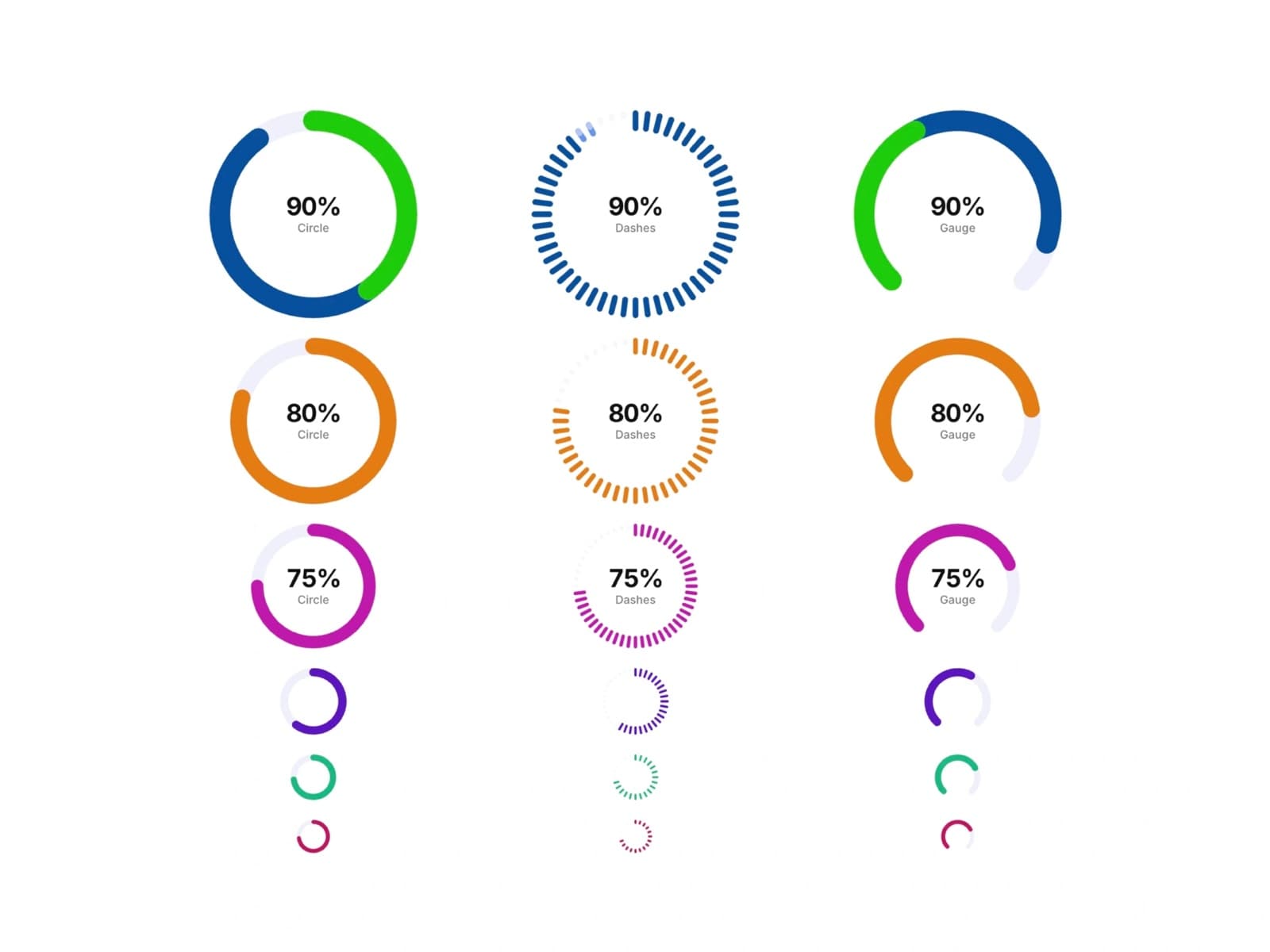
Data
Progress Circle Bars
$5
A data component built for Framer. Live preview below — interact with it directly before you buy.
About Progress Circle Bars
Progress Circle Bars is a set of animated circular progress indicators for Framer, with three distinct ring styles — solid Circle, segmented Dashes, and a half-round Gauge — all showing a centered percentage and label. Each ring animates its fill on scroll, comes in multiple sizes and colors, and drops straight into dashboards, stat sections, or skill/proficiency displays.
Features
- →3 ring styles: solid Circle, segmented Dashes, and half-round Gauge
- →Centered percentage value with label text
- →Scroll-triggered fill animation
- →Multiple sizes, from compact icon-scale rings to large hero stats
- →Custom stroke color and track (background) color per ring
- →Adjustable stroke width and corner cap style
- →Works out of the box — no setup needed
Use Cases
- →Dashboards and analytics pages
- →Skill and proficiency indicators on portfolio sites
- →Health, fitness, and habit-tracking apps
- →Onboarding and setup completion indicators
- →Storage and quota usage displays
- →Survey and quiz result summaries
Best value
Get every component with All-Access — $129
Progress Circle Bars and all 122 others, current and future.
Get All-Access