← All Components
Gallery
Layout Cards Page
$8
A gallery component built for Framer. Live preview below — interact with it directly before you buy.
About Layout Cards Page
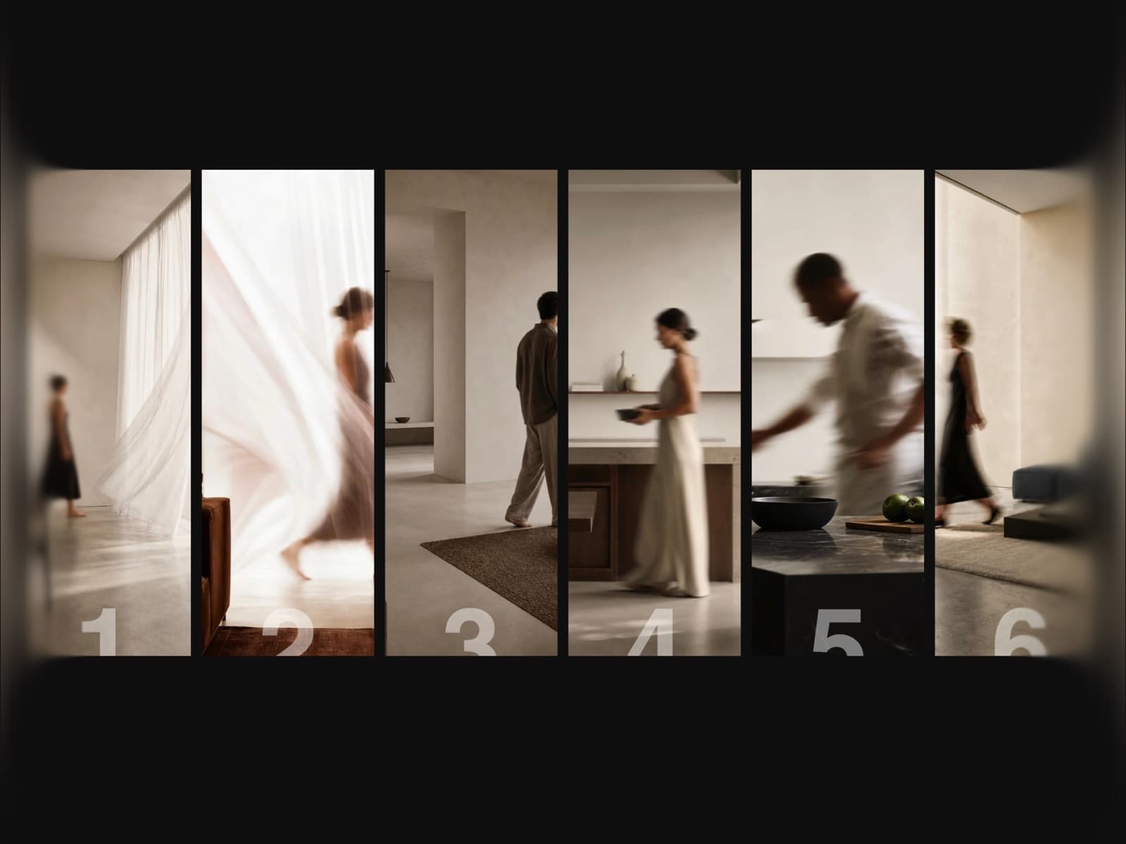
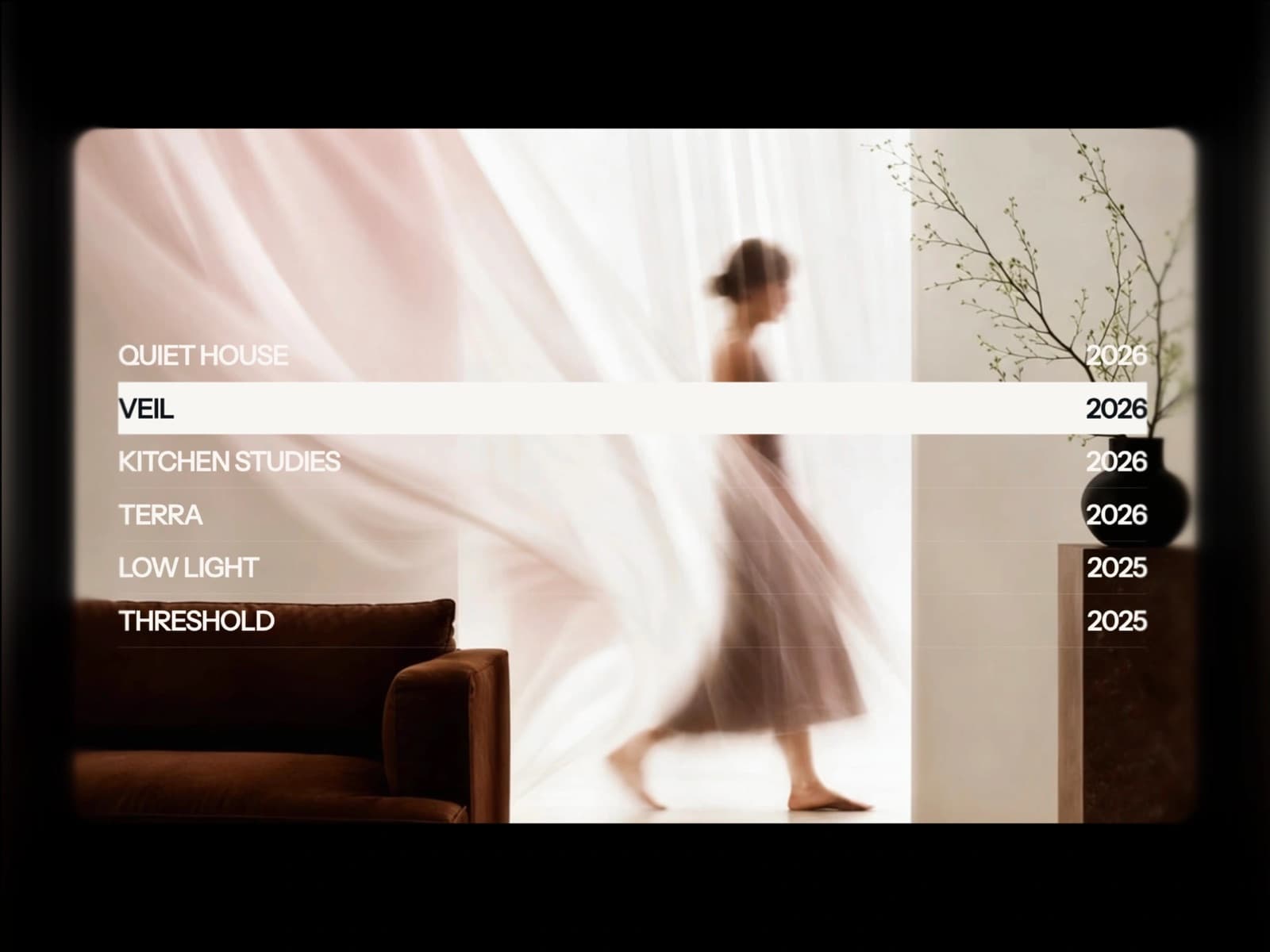
Layout Cards Page turns a simple image grid into a full-screen storytelling layout for Framer. Click any card and it expands to fill the screen with a title, description and call-to-action button, while the rest of the grid scales away and fades out. Fully responsive, keyboard-accessible and touch-ready — built for portfolios, agencies and product pages.
Features
- →Full-screen expand on click — cards scale from grid into a full view
- →Staggered text reveal — title, divider, description and button fade in with sequenced delays
- →Image hover zoom before expansion for a subtle depth effect
- →Per-card tone overlay so cards sharing one base color stay visually distinct
- →Animated left-to-right divider line under each title
- →Keyboard navigation — Enter/Space to open, arrows to move between sections, Escape to close
- →Swipe navigation on mobile — swipe left/right to switch, swipe down to close
- →Auto-switches to a single-column layout under 700px width
- →Optional index numbers and close icon for clear orientation
- →Focus ring for accessible keyboard navigation
- →5 customizable sections with image, title, description and button
- →Full property controls: fonts, colors, border radius, gap and sizes
- →Works out of the box — no setup or code required
Use Cases
- →Portfolio & personal branding websites
- →Creative agency & studio pages
- →Product showcase & feature sections
- →SaaS marketing & feature highlight pages
- →Photography & visual storytelling sites
- →Fashion & lifestyle landing pages
- →Editorial & magazine-style layouts
- →Event & conference websites
- →Architecture & interior design portfolios
- →Real estate listing pages
Best value
Get every component with All-Access — $129
Layout Cards Page and all 122 others, current and future.
Get All-Access