← All Components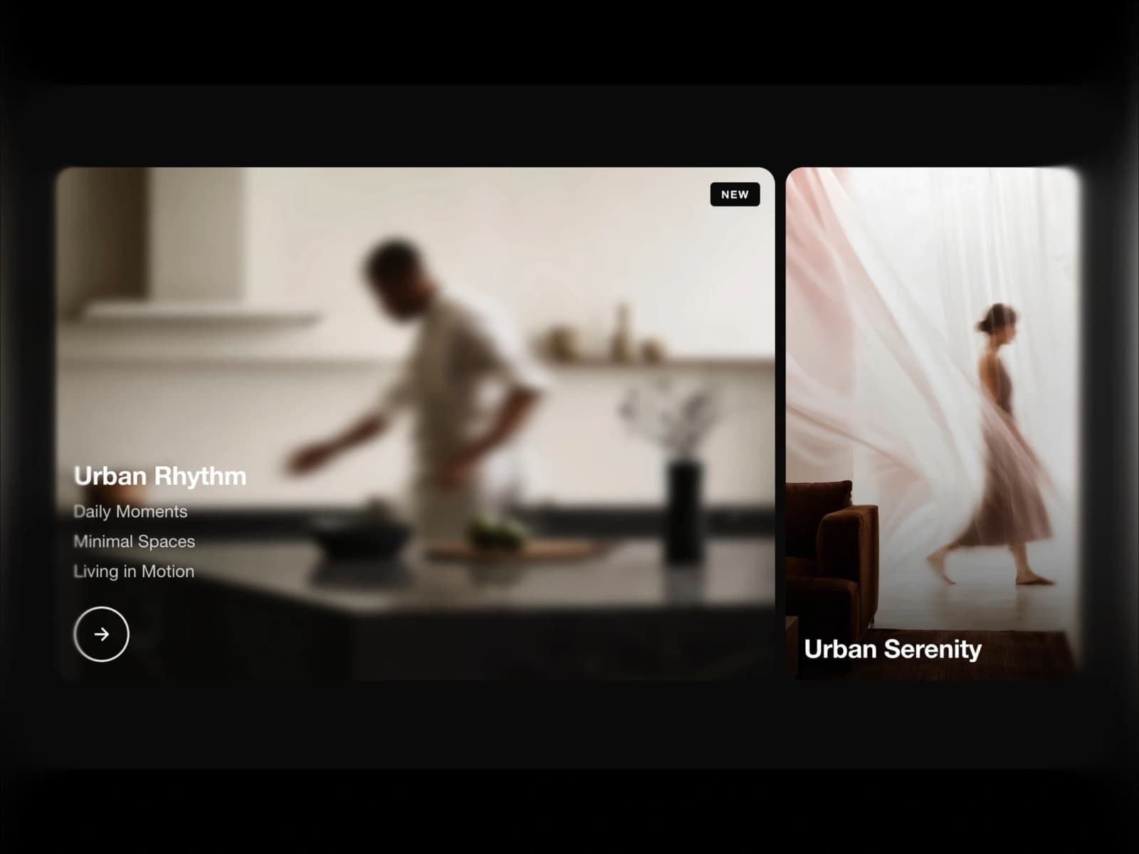
Section
Hover Media Cards
$9
A section component built for Framer. Live preview below — interact with it directly before you buy.
About Hover Media Cards
Hover Media Cards is an interactive image and video card component for Framer. Cards expand on hover with a smooth blur and reveal animation, showing a title, subtitles and a call-to-action button. Supports 2–3 columns, per-card glow, badges and custom overlays. Fully responsive with mobile tap support. Perfect for portfolios, agencies and landing pages.
Features
- →Expand on hover — active card grows wider with a smooth flex-grow animation
- →Blur & reveal — image blurs as title, subtitles and CTA fade in with depth
- →Image & video support — upload via Framer or paste any external video URL
- →Staggered animations — title, subtitles and arrow cascade in with timed delay
- →Glow effect — optional soft glow highlights the hovered card edge
- →Per-card overlay color — set a unique tint color for each card individually
- →Badge & tag system — add labels like NEW or SALE with custom colors per card
- →3 arrow styles — circle outline, filled button or no arrow
- →3 content alignments — bottom-left, bottom-center or vertically centered
- →7 aspect ratios — auto, 21:9, 16:9, 4:3, 1:1, 3:4 and 9:16
- →Mobile responsive — stacks vertically with tap-to-reveal on touch devices
Use Cases
- →Portfolio & personal branding websites
- →Creative agency & studio showcase pages
- →Fashion, lifestyle & lookbook sections
- →Photography & visual storytelling galleries
- →Film, media & production company sites
- →Architecture & interior design portfolios
- →Product & service feature highlight sections
- →Real estate & property listing pages
- →Editorial, blog & magazine-style layouts
- →Travel & hospitality brand websites
- →SaaS marketing & feature overview pages
Best value
Get every component with All-Access — $129
Hover Media Cards and all 122 others, current and future.
Get All-AccessMore Section